Background
For this project, I was given a random genre of restaurant, and a price range. I ended up with an Irish Pub, in the $-$$, low range of price. And thus, Mooney's Irish Pub was born.
I decided to place the restaurant in my hometown, making this project all the more personal to me. I knew that my town needed a new traditional, affordable Irish pub, as the one that was there previously had been closed and replaced with a high end restaurant.
After doing a competitor analysis of other nearby pubs, I set out to create a place that would capture the Irish pub spirit that my town was now lacking. I also decided to veer a little more on the polished side with the digital work compared to pubs that had been established decades ago, as a business opening up in 2025 should have.
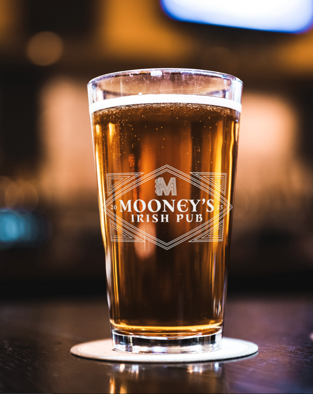
Once I had found the reason for this business, in a place I knew there would be demand, I began the branding. I decided to go as traditional Irish as possible with a slight modern slant. As I began logo design, I wanted something that felt classic, bold, and in the form of an emblem that would stand out. Mooney's was to be a local household name, and hometown favorite.

Design Process
I decided on a classic feeling letterform brand mark. I brought it Celtic style knot and line work designs, which I also incorporated into the border of the emblem. For colors, I went full traditional Irish, with green, orange, and gold tones to bring out that Irish spirit.
I chose the emblem shape based on the wooden pub signs that I saw during my time studying abroad in Dublin. Many of them had very lovely geometric designs, always accompanied by a distinctly Irish, hand-lettered typeface, which I found a font close to.
Afterwords, I began a responsive logo collection, designing the emblem in black, white, full color, descending it into smaller formats, and designing other orientations. I wanted to cover all the bases I could need for this brand, thinking of merchandise like shirts and pint glasses, as well as different web and print formats.
I designed additional collateral before getting into the web design, such as patterns, and a set of forty icons in the same line work style.
As this all came together, I began to research restaurant UI, from home page layouts and menus to checkout and e-commerce flows. I found that many of these sites had very antiquated design, legibility and scale issues, and almost no content as a whole. I wanted Mooney's to stand out in the digital age as a new business.
I wanted the web design to be as fun, approachable, and community-oriented as I imagined Mooney's would be. For the home page, I took inspiration from other local restaurants that hosted events, and made a nice big carousel as the center of attention. Below that I put in a little social media ad to bolster that community vibe, then a little merchandise scroll to add an extra level to the e-commerce side, as well as to give a few of my extra logo designs a chance to shine. I added in an about page featuring my fictional founder to make it feel all the more real and the website basics were established.
Now onto the menu and takeout flow.


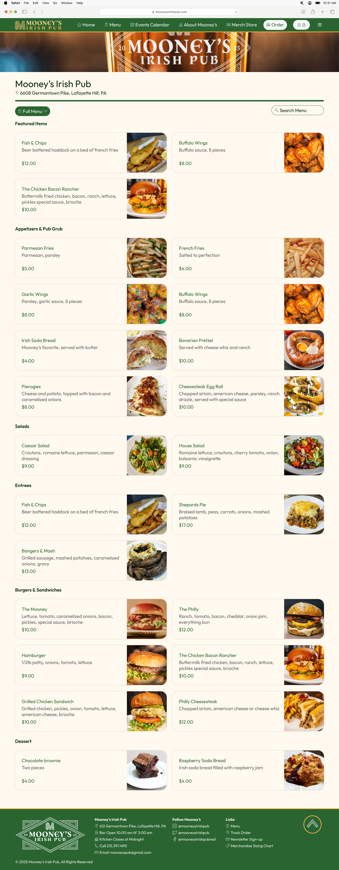
For the menu, I wanted to focus primarily on classic bar food, as Mooney's was pub first, restaurant second. I found that the majority of the pub menus I researched had all the staple bar classics, and then some traditional Irish dishes in the entrees section, so I emulated that.
Referencing six different Irish pub menus, I compiled together Mooney's menu, featuring 26 items and plenty of customization.
For the takeout menu, I leaned more into the digital layout, in the style of services like Doordash and Toast. Going through basic input fields like contact info, and selections like tip and pickup time.


Conclusions
Throughout this project, I learned a lot about laying out items like the takeout flow and menu. I found things I liked and disliked about other restaurants UI, and updated them in my own, avoiding harsh colors, sharp edges, and small buttons. At the end, Mooney's really came to life.