Overview
For this project, I worked on a health application, designing both a light and dark mode variant, an icon set and page layouts, and a working prototype. I chose to work on a pedometer, and went with a quick, catchy name: Steppr.
This was my first time working with variables and color mapping, and it made for some new challenges. Accessibility was a huge consideration in this project. Consistently checking contrast to make sure it was passing AA standards was crucial in my choice of pallets.
Rather than trying to break the mold in the pedometer app market, I focused more closely on learning and refining my skills in Figma, using variables to create the two swappable color modes.
That is not to say that I wanted to create something bland just for the sake of learning other skills, so I added in a new component to my application. While I was doing research into the market and competition, I found that most generic pedometer apps had ridiculous subscriptions, and very little overall content. So for my app, I wanted to incorporate an option to follow curated workouts.
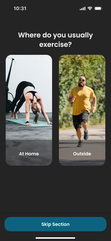
I referenced a variety of other pedometers to get feature inspiration, in addition to a few workout focused applications. Steppr is a hybrid exercise application with a primary focus on tracking those daily steps, but plenty of other options to keep users interested.


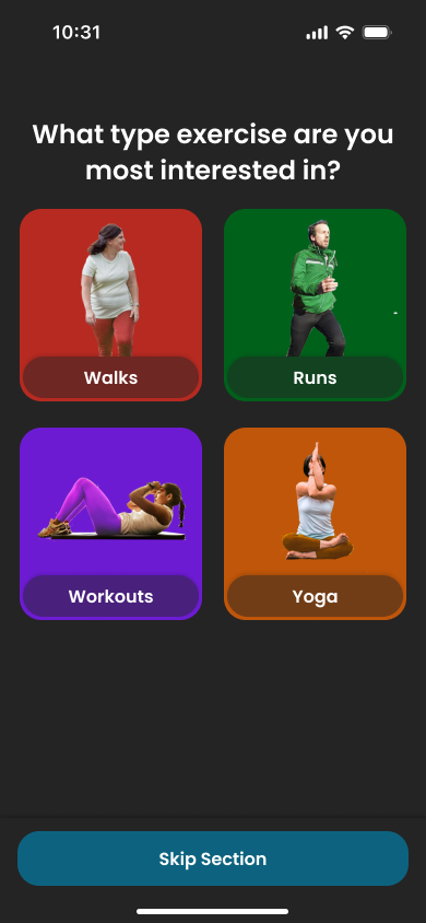
Since tracking steps was the primary focus of the app, I made the "Runs" part in the workout section have three separate categories, divided up by difficulty. I based the three difficulties on run length and intensity, giving options in the app for serious runners as well as people just looking to stay in shape.
Steppr is designed to be accessible to anybody regardless of experience, or even interest in running at all, so I also put in some basic exercises like yoga and stretching in a more general "All" section.
It was important that there be multiple ways to engage with the app, even if they would not necessarily effect the primary function. This would be what sets Steppr apart as a service.
When the user selects a workout or run, it opens a menu breaking it down into steps. Simple previews, calorie and step estimates, these are all things universal to this type of application. Where it gets fun is when the exercise is started.
For exercises involving outdoor, step-based movement like walks and runs a map opens up of the users surroundings. As they go along, it records their path so that they can see where they went.
I considered a social component for this, allowing people to share their runs with friends, but I decided to keep it simple, at least for the time being, and focus on the fitness functions.
The Design Process
I began this project by researching other apps like Apple Fitness, Pedometer++, and Home Workouts to observe what I liked and disliked in their UI and functionality. What I knew I would need was an easily navigable application, plenty of ways to track statistics, an opening questionnaire to set goals and choose difficulty level, and some sort of reward system to keep people motivated and review progress.
After figuring out some basic logo concepts, all centered around the classic running man, and a color scheme, I laid out my wireframes to get some concept of how I wanted the app to look before launching into the full hi-fidelity.
I wanted a very clean, rounded, approachable feeling design with simple navigation, as people with all different levels of tech-savviness would use an app like this.


Next up, I finalized my color pallets, and set up all the text and color styles I would need. Then I put it all together, spent five hours scrolling stock images for the workout imagery (I think I have seen every stock photo of a person running in existence), and all that was left was to set up all the variables and create all the animations using component states.
The variables turned out to be a rather simple process, though very rewarding to see all the color pallets I put together find their places. The series of micro animations for things like the step tracker and run progress was probably the most challenging part of the process. Some could absolutely still be refined further, but for proof of concept they were satisfactory.
Pictured on the left is most of my design system. Things got a bit complex!


Conclusion
Overall, I found this project to be very rewarding, and ended up with a polished design that still has a lot of room for improvement. I learned a lot about the requirements of exercise apps, as well as building on my Figma skills in component animation, layout, styles, and variables.