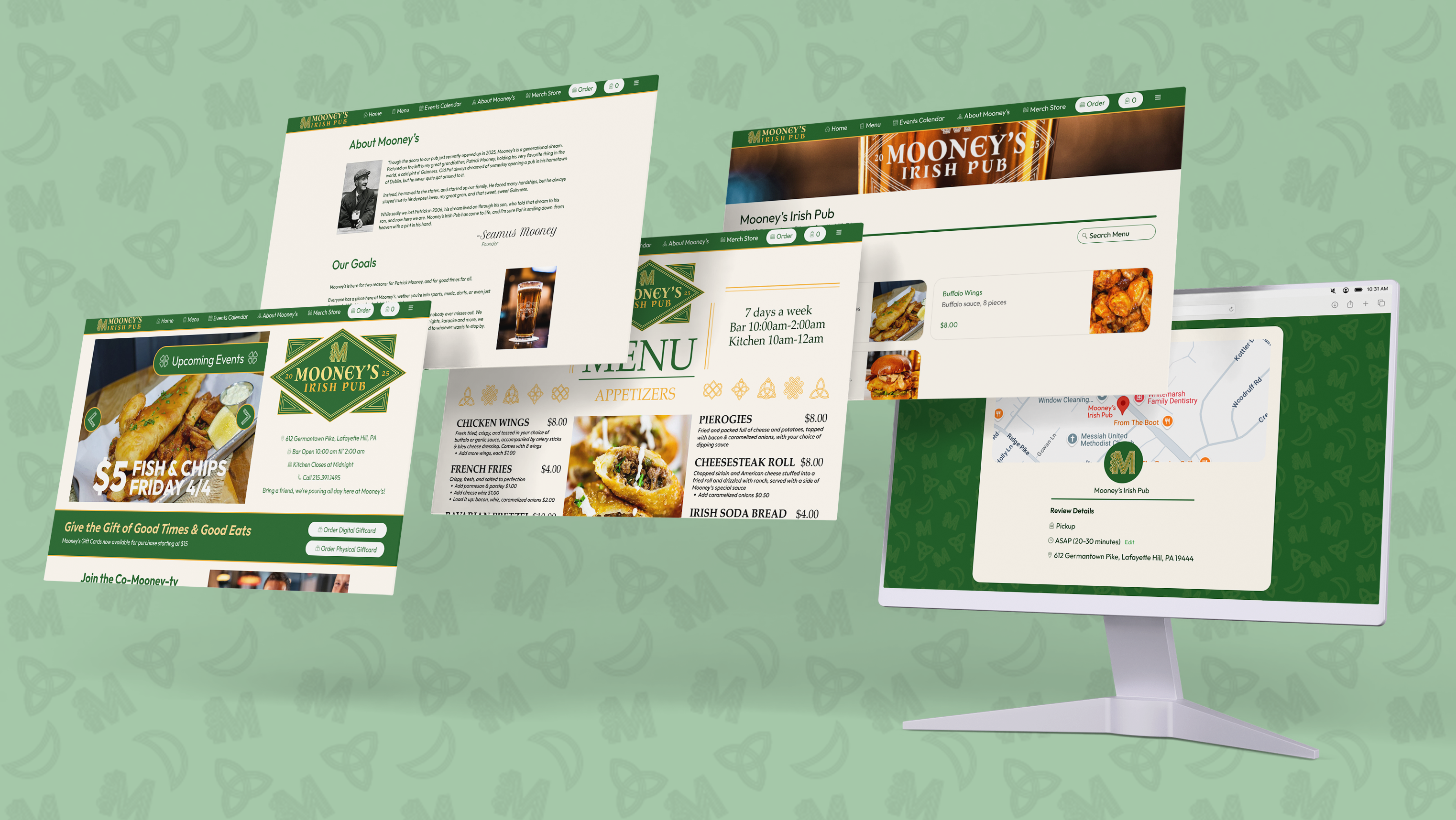
Overview
This project was a paid job done for a client who wanted a parking application. The client came to me with basic layout ideas and a strong app concept. ParkTrade is designed to allow college students on large, busy campuses to ride-share to parking spots in order to trade with the student who was already parked there. I worked with a partner who did all of the coding side of the project, while I was given nearly full creative freedom for style, color choices, and to some extent branding direction.

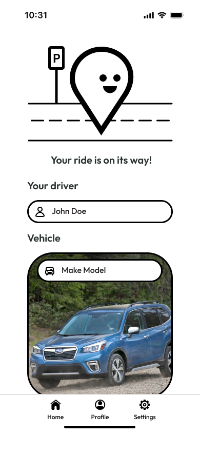
The functionality of the app is very straightforward. A user either can request a spot, then go pick up the student to trade with, or vise versa. The initial design had spot/pickup requests appear on a map where the other-end user could view their location and profile, but that ended up just being changed to a list at the request of the client, for simplicity sake.
Before getting to the request option, a user has to do a short identity verification by selecting their school, uploading a picture of a school ID, a picture of their car, and a picture of themself, to prevent anyone from taking advantage of this app. That functionality is not shown in this demo, but is in the developed app.
This demo on the left shows the original design prototype with the map, which did not make it into the final app. It is shown from the perspective of a user looking to find a spot for themselves. The profile popup that appears also was fleshed out more in the final app design.
A few of the menus (like the college select) shown here are also simplified for the sake of the prototype, and in the final version were changed to iOS style menus. The client only wanted an iOS version and did not want to bother with android, so I did not flesh out a unique design for those menus.
I would have added a demo video of the actual app, but it has not actually gone live yet, and I am not up to date on the client's plans for it, but from a design point of view this is about the same.
Design Process
Since the client did not have a large amount of input as the the design itself aside from the content they wanted on each page, I was able to make a lot of the creative choices. I opted for a bright purple/pink and black color scheme. I found that the majority of parking related apps on the market used a bright green or blue, so I wanted to set ParkTrade apart, but not stray too far by incorporating too many different colors.
I referenced other parking applications to figure out the best style, and found that a clean, straightforward look was the way to go. The app overall did not require a large amount of pages, as it served one function, so I was able to focus on making each page very easily navigable and simple.
All the icons were from my personal library, and I designed a few new graphics. I opted for a fun, simplistic style that would be both approachable and enjoyable to the college age demographic. So as not to be boring, I made the majority of the graphics animated gifs. I wanted the app to have a sort of mascot feeling character, similar to other driving apps like Waze.
Simple was really the main focus with the whole progress, as is reflected in the tagline I came up, "Campus parking made simple."

Challenges
My designs for ParkTrade practically underwent a micro rebrand halfway through. I began by leaning heavily into the cartoony, friendly, mascot-y side. I used heavy lines for everything, and invented a little pinpoint marker character that would be used in all the graphics. However, this was when the name for the app was SpotFried, but it got changed to ParkTrade halfway through the development process.
To me, this felt like a very different application. I wanted it to still be friendly and have a cute brand mark, but my cartoony designs felt unprofessional for what was supposed to be a sleek app. And when it comes to ride sharing applications, sleek is important, as it gives a better sense of safety. These realizations were important, and so I remade a lot of the UI.
I kept the fun and friendly vibes in the font and roundness, but left the purely cartoony style.
Old Version

Updated Version

Conclusion
This design presented new challenges for me. As one of my first freelance jobs, it was challenging working for a client, especially one who did not have strong opinions about the overall design. I did not know what direction to go, but I think it landed in a good spot, and the client was very happy with it.
I made a bunch of extra animations featuring the character I did not end up using, which is unfortunate. But I am glad that the app moved in the direction that is best for it.